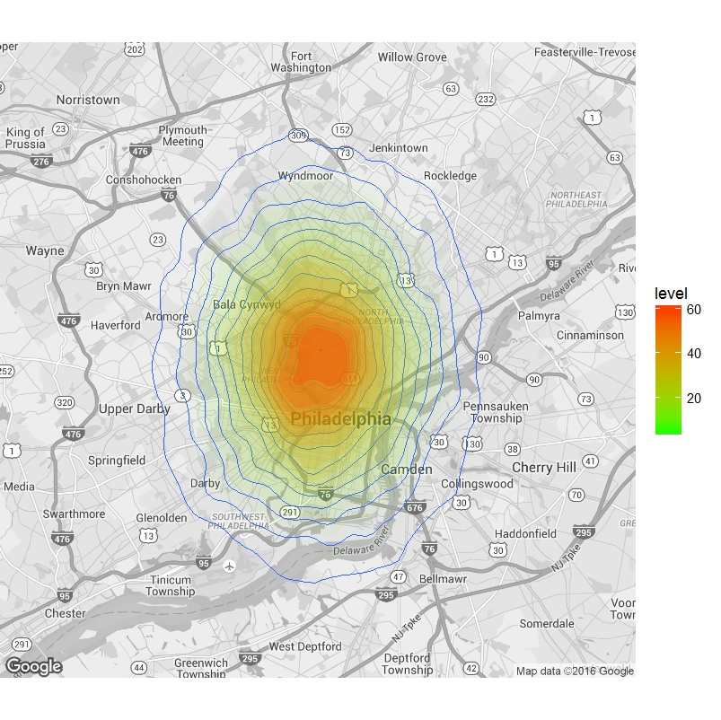
I go crazy for fancy data visualizations in R, and a figure in a recent publication has had me wondering if there is an easy way to incorporate density distributions (or as in their case, a distribution of f4 statistics, that are often used to estimate genomic admixture), plotted as heat-maps overlaid on geographical maps. As it turns out, it’s a breeze to make these plots in R, using the ggplot2 package.

So I simulated some geographical data (which you should switch out for your real GPS coordinates), and obtained posterior density estimates for effective population sizes that I had previously used in another tutorial as an example. Importantly, you will have to edit (1) the density data, here represented by “hpars”, (2) the positions table – here I have simulated some data around coordinates for Philadelphia, PA, which you should replace with your own geographical coordinates for your data of interest from (1).
library(ggmap) #Load libraries
library(ggplot2)
hpars <- read.table("https://sites.google.com/site/arunsethuraman1/teaching/hpars.dat?revision=1") #Read in the density data
positions <- data.frame(lon=rnorm(20000, mean=-75.1803458, sd=0.05),
lat=rnorm(10000,mean=39.98352197, sd=0.05)) #Simulate some geographical coordinates #Switch out for your data that has real GPS coords
map <- get_map(location=c(lon=-75.1803458,
lat=39.98352197), zoom=11, maptype='roadmap', color='bw') #Get the map from Google Maps
ggmap(map, extent = "device") +
geom_density2d(data = positions, aes(x = lon, y = lat), size = 0.3) +
stat_density2d(data = positions,
                 aes(x = lon, y = lat, fill = ..level.., alpha = ..level..), size = 0.01,
                 bins = 16, geom = "polygon") + scale_fill_gradient(low = "green", high = "red") +
  scale_alpha(range = c(0, 0.3), guide = FALSE) #Plot
And voila! Do give it a try with your data, and leave your comments below.