
Conference season is upon us! Around the world, thousands of scientists face a daunting task: designing a scientific poster.
It should be sleek, yet informative; eye-catching, yet professional; and most of all it should attract the attention of your future advisors and collaborators who keep making trips to the beer and wine counter.
Here are some tips and tricks to make this perilous labor a little easier:
1) Follow the rules
I’m not sure why I have to say this but: read the instructions to presenters. Too often I see posters that are larger than their provided boards and spill onto their neighbors’ posters. #rude
2) Step away from the computer
In the early planning stages of your poster, use a pen and paper to sketch things out. Having an established storyboard will help when you move your ideas to the computer.
3) Use the right tools
PowerPoint is the program of choice for most poster-making scientists, and it drives me crazy. PowerPoint is intended for slideshows (so most of its tools are pointless for poster design) and the color you see on your computer screen will likely look different in print. Still, I can see the appeal: everyone already has PowerPoint so multiple collaborators can work on the file.
Bottom line: Use PowerPoint if you must. But if you plan to make several posters in your life, it’s worth investing the time to learn a program specifically for layout design: Adobe InDesign or Illustrator for the rich and spoiled, or Scribus or LaTeX for an open-source alternative.
4) Be bigger and better
12-point Times New Roman won’t cut it on a poster. Minimum recommended text sizes are: 85 pt font for the main title, 36 pt for subheadings, 24 pt for body text, and 18 pt for captions.
5) Be a strong, silent type
Less text = more visitors to your poster. It’s OK (albeit strange for most scientists) to use incomplete sentences and bullet points, and to ditch details. Can you present your methods as an illustration rather than text? Can you present your results in a graph instead of a table? Go for it!
6) Flaunt your font
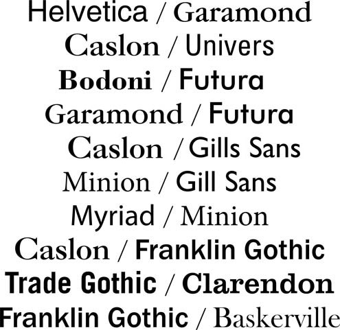
In the early planning stages, pick two complementary fonts to use. I like to use one serif font (the fonts with little “feet,” or serifs, on each letter) and one sans-serif font (e.g., Helvetica or Calibri). Use one font for all titles and subtitles, and the other for the author line and body text.
Bonus tip: scientists who use the font Comic Sans are subject to ridicule and embarrassment. Don’t use it.
7) Color me impressed
The most effective and legible posters generally stick with three colors: a text color that approaches black, a near-white or muted background color, and an accent color. I use Adobe Color CC to pick a palette that perfectly matches my photos and figures.
8) Stay within the lines

To keep your poster looking neat and tidy, please (please!) use gridlines. And if you don’t have an artistic eye, consider working with a template.
9) Let it breathe
Make sure to leave enough space around the border of your poster (several inches) and between sections (at least one inch). It may feel like you’re wasting valuable real estate, but it’s a simple way to make a poster feel less cramped and more inviting.
10) Print and present
After weeks of blood, sweat, and edits, it’s finally time to print your poster. Many universities offer inexpensive printing services, but watch out for long wait times and low-quality paper or color. Businesses like FedEx can also print posters, but I prefer online sources like makesigns.com, which can print on wrinkle-free canvas paper and deliver directly to your hotel within one business day (not that you’ve waited until the last minute, right?)
For more tips and tricks, you can find a list of poster-making resources on my website.